


After months of planning, preparing and polishing, we’re delighted to introduce our shiny new branding and signage – as modelled by Alan outside our office!
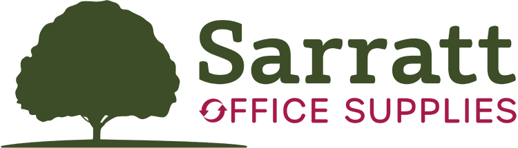
We’ve spent months considering how our new brand will take us into the future market of office solutions. As we’re a company focussed on eco products and a greener way of working, we’ve gone back to our roots (literally!) and chosen to incorporate the Sarratt village oak tree into our new logo. We feel that using the tree reflects our values and symbolises our love of serving the local community. Although we are no longer located in the village, we see the tree was synonymous with our name and it’s relevance for the ‘greener’ direction of our business.
We have taken the time to think about the colours of our brand. We’ve used green to signify our eco focus, and thought the earthy tones of the shade is perfectly complemented by a splash of dark pink.
Our new website is packed full of new functionality to take us into the era of online presence. We are now well placed to update you with new products, business news, and providing information on how we can help your business consolidate orders and work smarter. We are now able to offer you business solutions that go way beyond the every day core stationery products including managed print, secure shredding, printed materials and promotional products.
We’re also delighted with our new exterior signage, and have rolled out our new logo to the remainder of our marketing, both on and offline.
We hope you like our fresh new look. As always, we welcome any feedback or comments you may have on our brand and website.